
*View accurate shipping rates and availability






111 Items


Up to 70% off across the store, plus free towels and mirrors up for grabs on orders over $800*


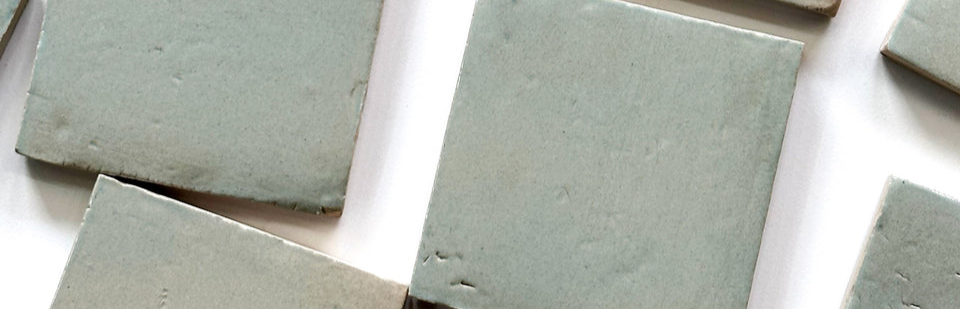
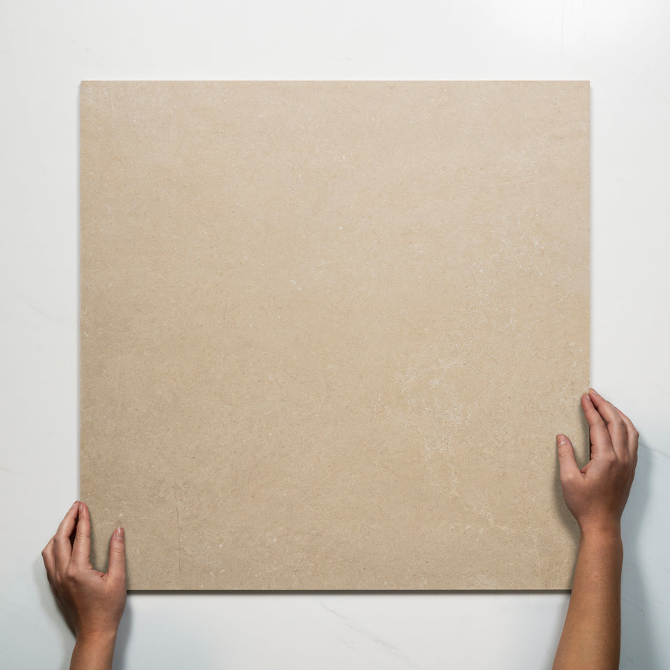
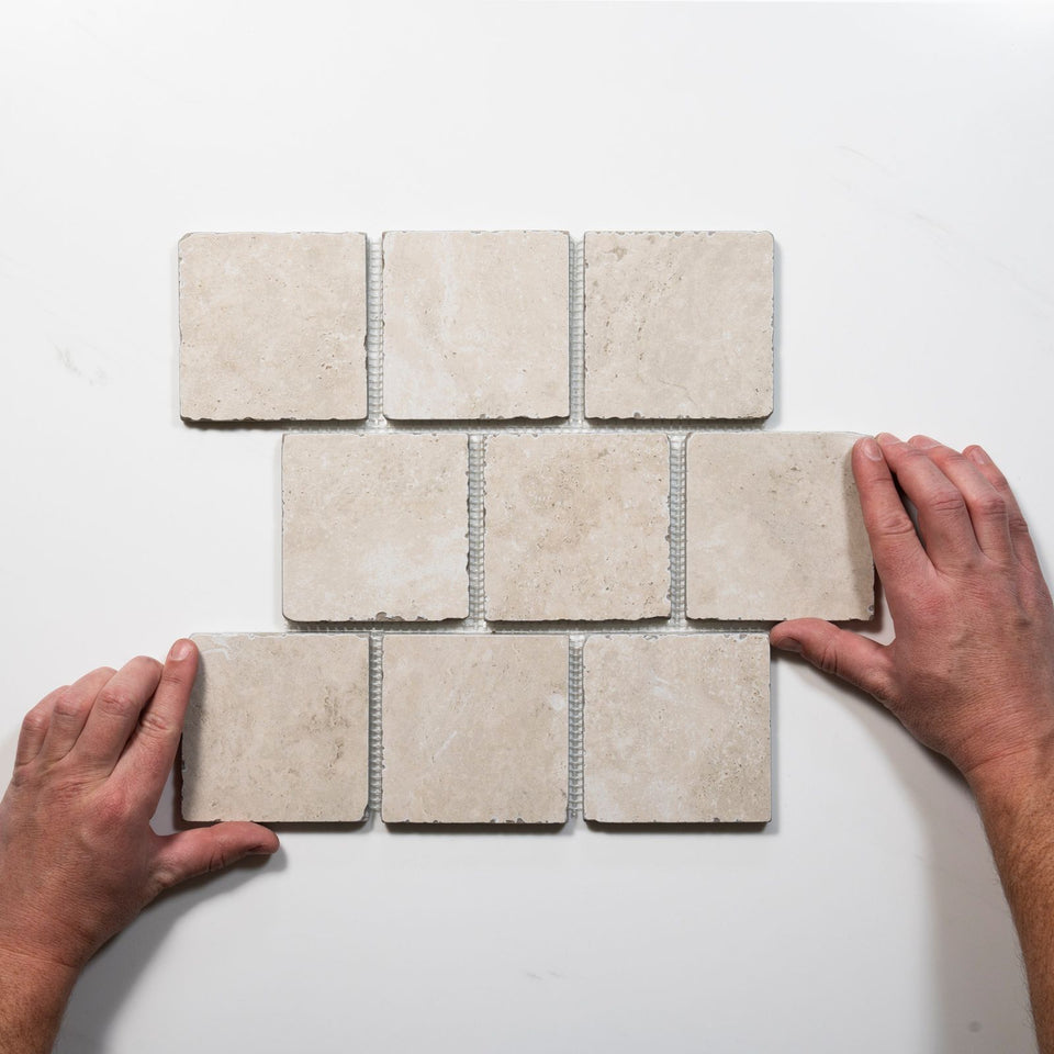


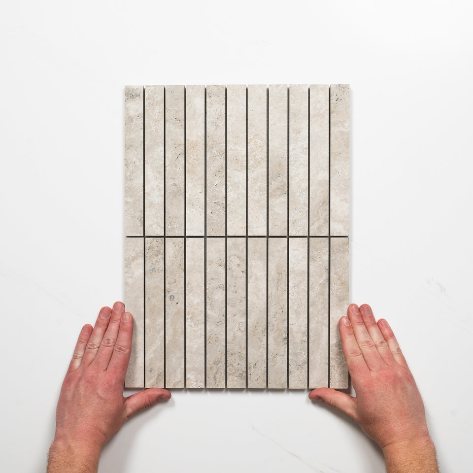


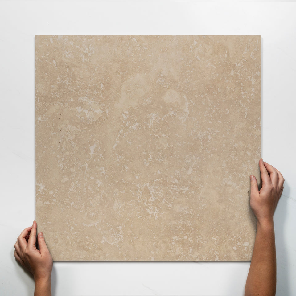

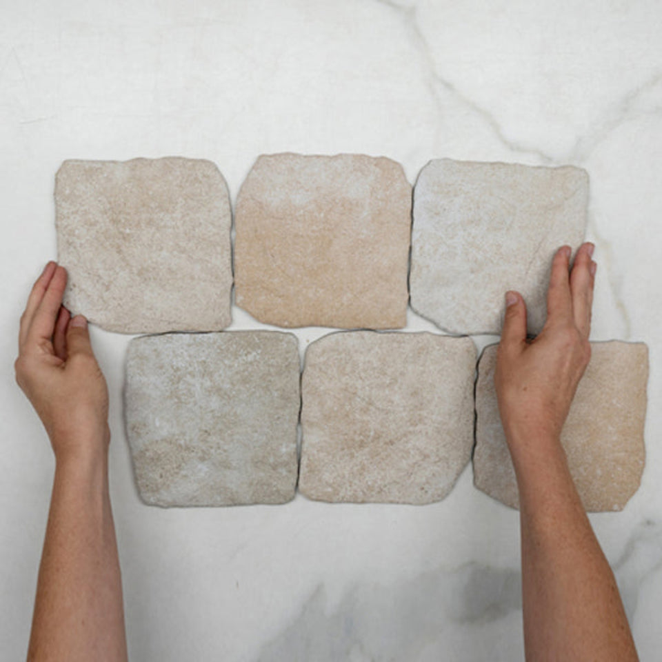


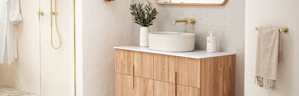

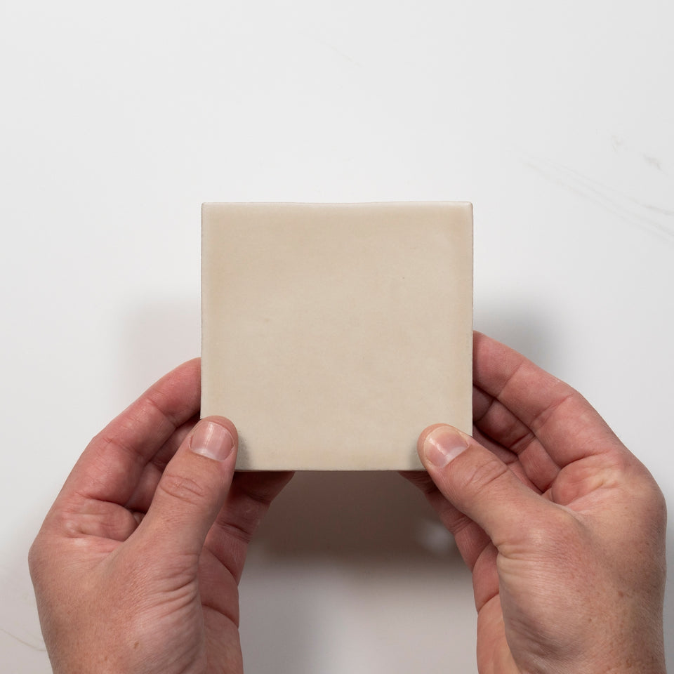
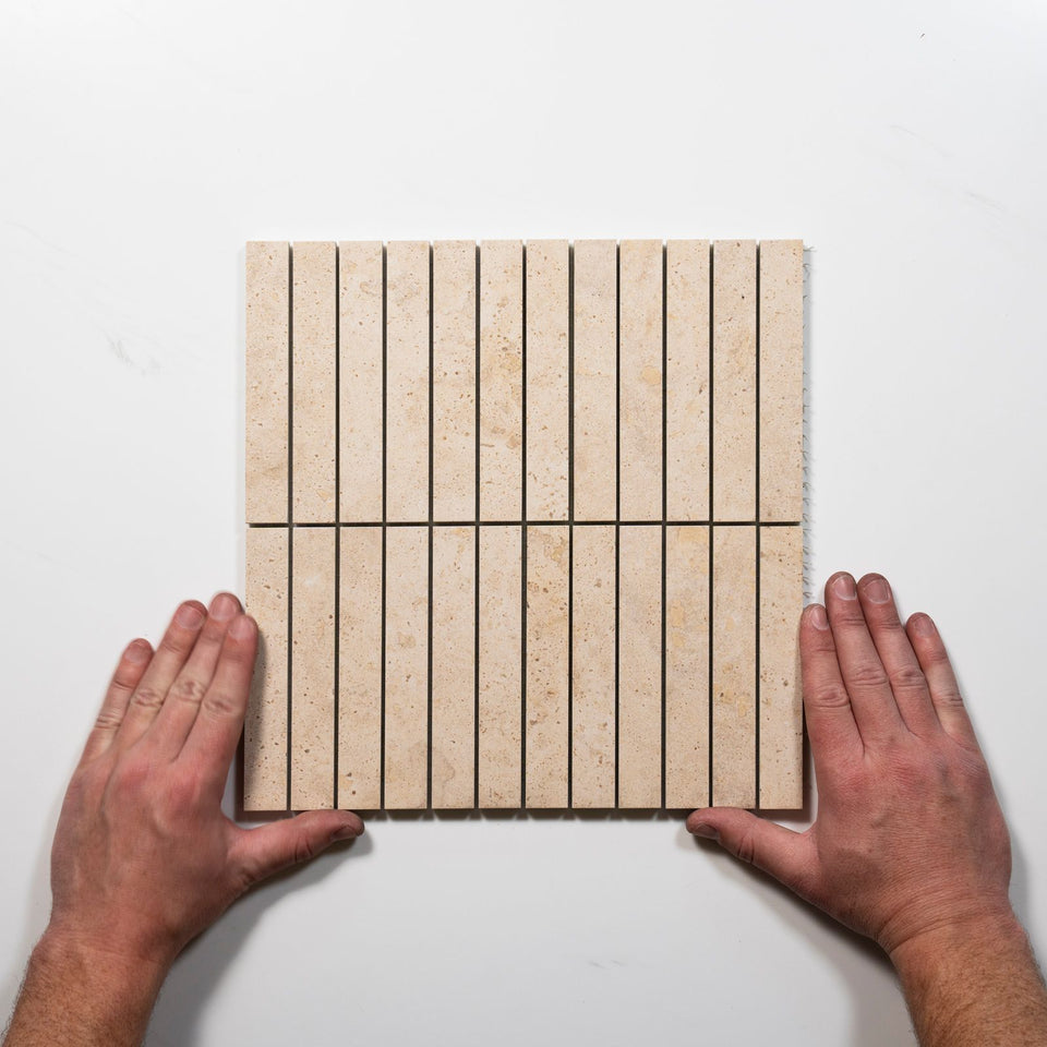


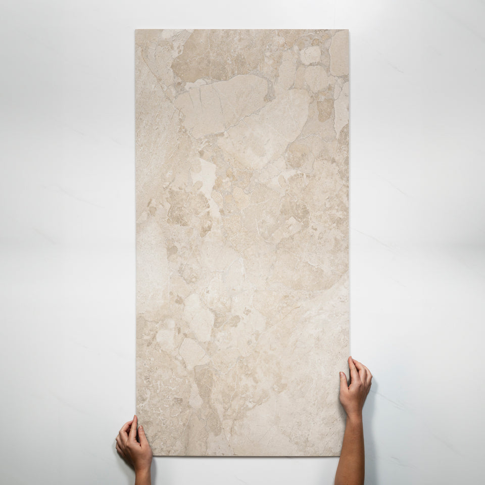
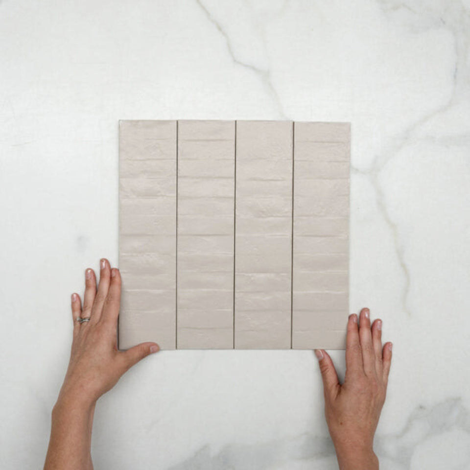
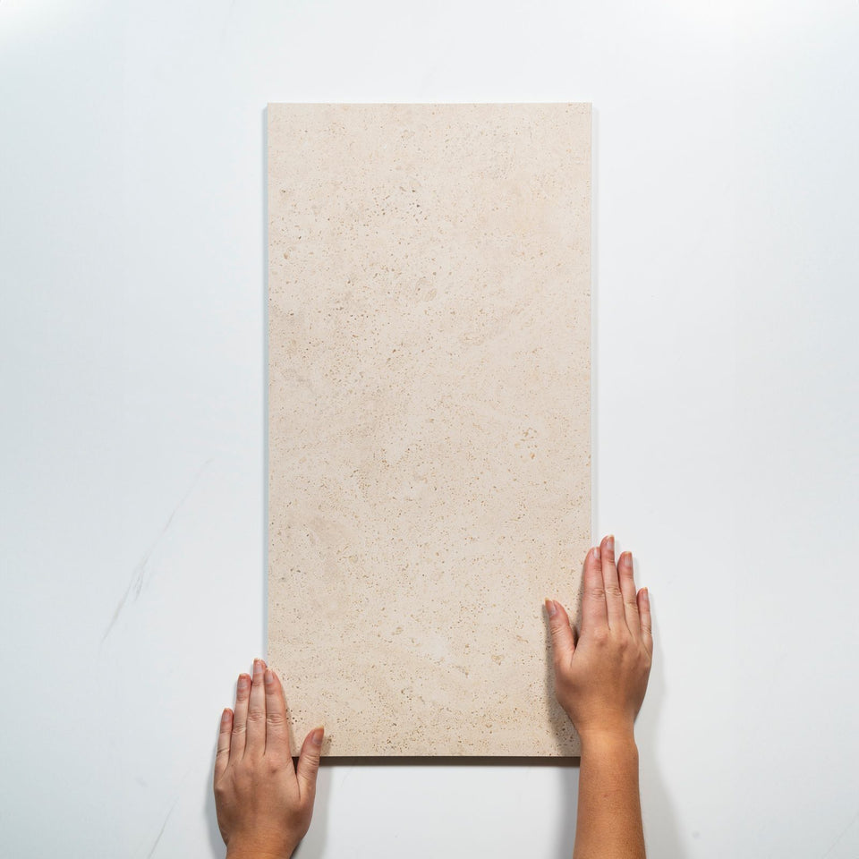

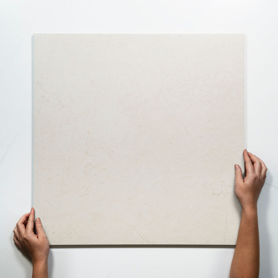

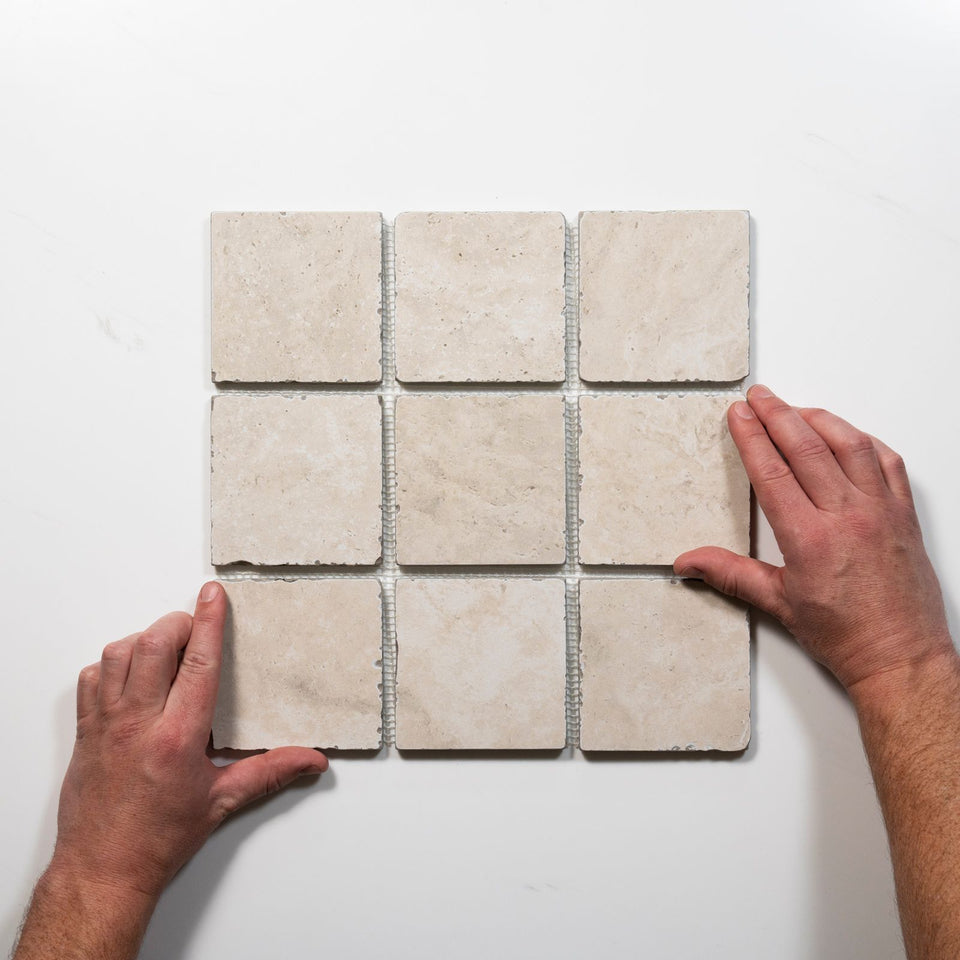
Beige is the warm end of the neutral family. It covers cream, ivory, sand, champagne, taupe and the greige that sits between grey and beige, and it appears in this collection across travertine looks, limestone looks, terrazzo looks, finger mosaics, handmade-look ceramics and natural stone. The first decision is undertone, because it changes how the tile sits beside the other materials in the room.
The sections below cover undertone, whether beige looks dated, grout, pairings, finish, the slip and Area lines, and the ranges. For rooms, see the bathroom tiles collection and the kitchen tiles collection.
Beige is a wider range than the word suggests. It can be creamy, mushroom, honeyed or almost greige, and each undertone changes the room. Hold the tile against the fixed finishes, especially cabinetry, stone and paint, because when the beige feels right beside those materials the whole palette becomes easier and the room gains warmth without a second strong colour.
Undertone has a major influence on the final effect, and greige, taupe and sand generally feel more contemporary than strongly yellow or orange beige. Compare a tile with the room's natural light, wall colour, cabinetry and benchtops, because one surface can look warmer or cooler depending on its surroundings. The colour names here signal the spread: Cream and Ivory, Taupe, Champagne, Vanilla, Sand and Rustic.
Beige tile is not outdated, though a specific shade of beige or the way it is combined can look dated. Yellow, orange or pink-toned tiles, small glossy formats and bright white grout can recall interiors from the late 1990s and early 2000s. Contemporary beige takes another approach, with balanced undertones, matte finishes, larger formats and carefully chosen contrasts. Greige, taupe and sand beat yellow beige. Large-format matte tile beats small glossy squares, and tonal grout beats bright white. Vertical stack or herringbone beats a repetitive grid, and warm wood, black details, white and green beat beige paired only with other neutrals.
The direction for 2026 bathrooms is similar. Beige, warm ivory and soft grey travertine looks lead, replacing the cooler grey marbles of five years ago, and warm neutrals are overtaking cool greys. Natural material aesthetics, such as stone looks and warm neutrals, have shown staying power across several renovation cycles, so treat the foundation tile as long-lived and use accents for current trends.
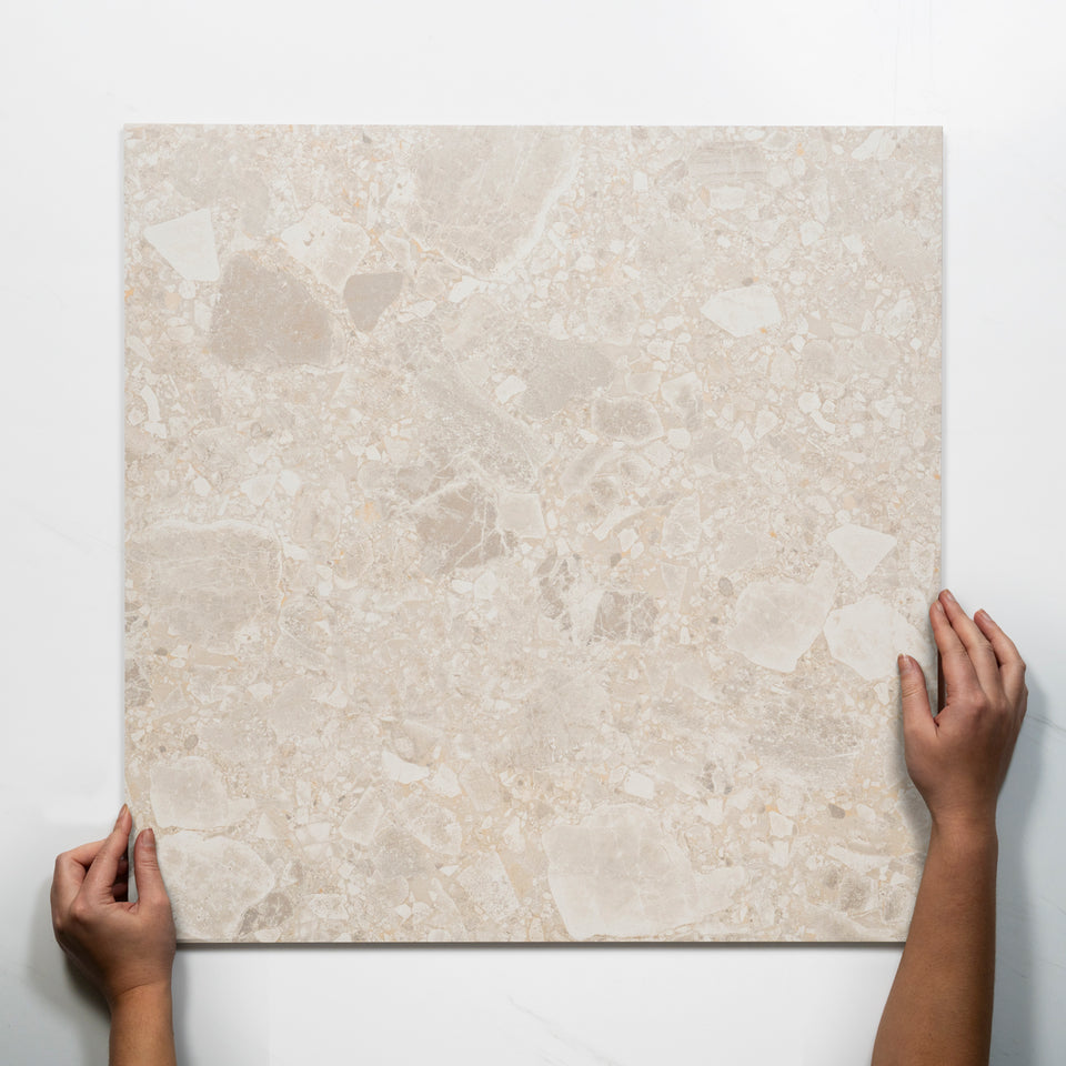
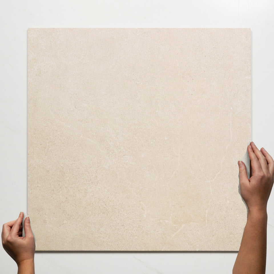
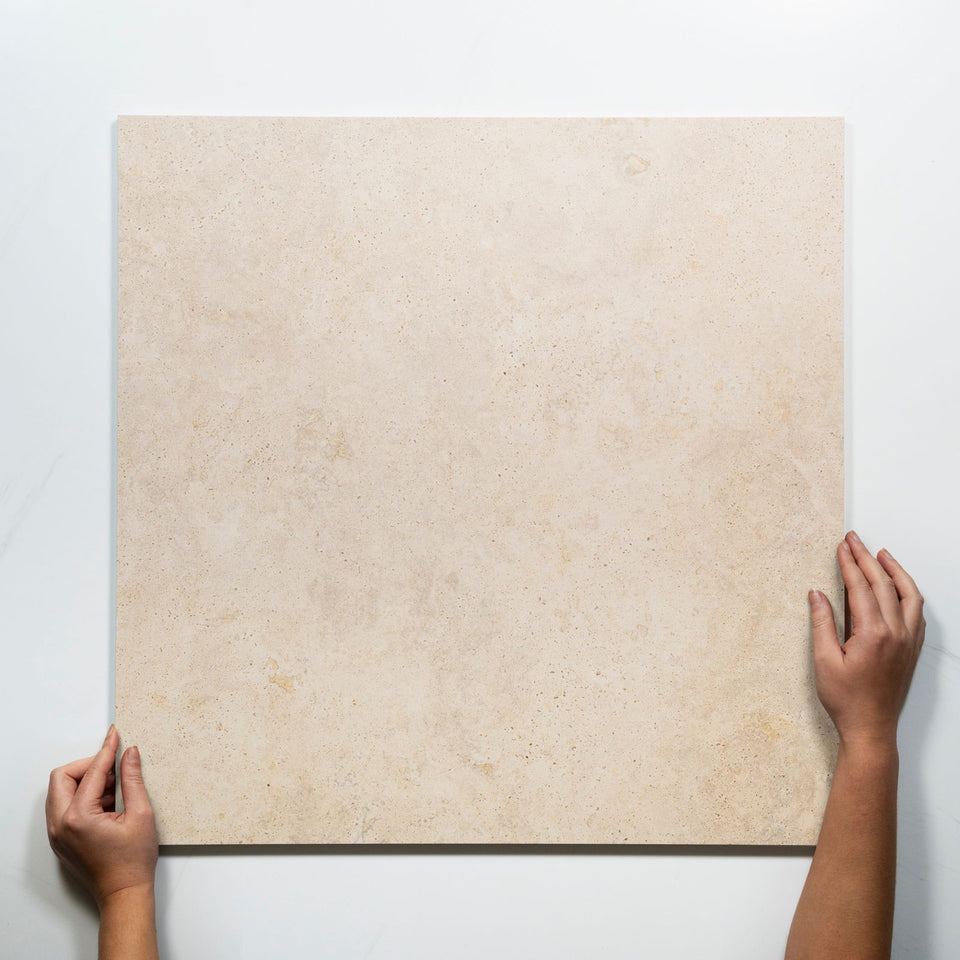
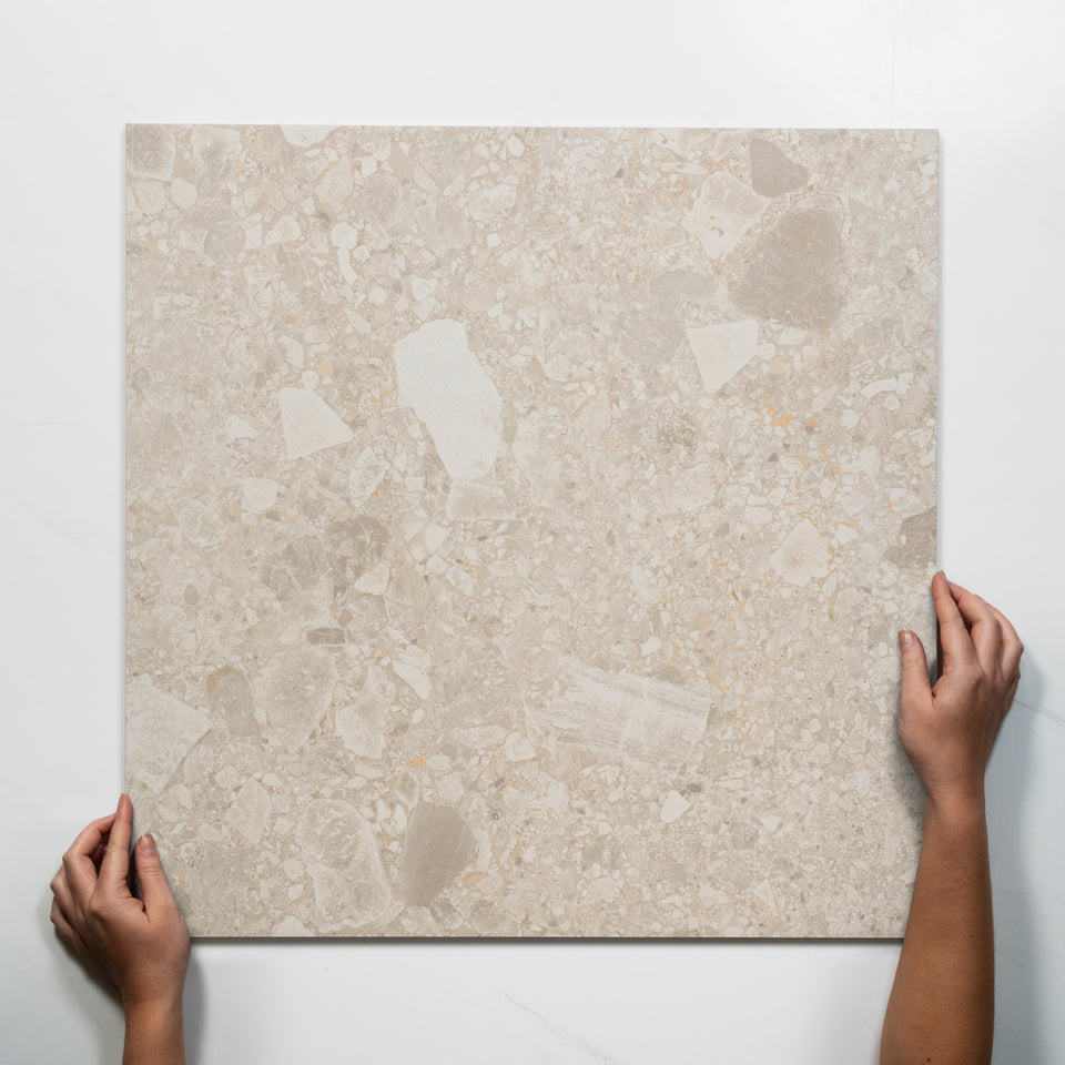
Much of the beige range borrows from stone. Ardenne is a travertine-look porcelain that draws on cross-cut and vein-cut patterning, with 24 unique faces in 600 x 600mm so repetition is practically a non-issue. Avedon is a limestone-look porcelain with soft tonal variation and gentle veining, and Avorio is a travertine look with a Tech Grip finish and warm ivory tones. Tuscan is a travertine-look porcelain in 600 x 1200mm, giving the durability and low maintenance of glazed porcelain. Nimbus has 24 unique faces and the soft movement of natural stone, and Roccia is a lappato that captures the spirit of raw stone.
For the look in more depth, see the travertine look tiles collection. Real stone is in this collection too: the tumbled beige travertine subway is natural stone, and it requires sealing. Natural stone and porous beige tiles need the right sealer to protect them. The natural stone tiles collection covers the real thing.
Grout changes beige more than most colours. A matching beige or tan grout gives a continuous surface, best for large formats and small rooms. A warm light grey gives subtle definition on greige and balanced beige. A warm brown adds depth on stone-inspired floors, charcoal gives strong graphic contrast on patterns and feature walls, and bright white emphasises every joint, which suits only small decorative areas. For high-traffic floors, a slightly darker tonal grout is more practical than a very light one.
Cool greys need care. A cool grey grout can make warm beige look more yellow, while a warm neutral creates a balanced result, so test grout beside the actual tile. The usual recommended gap is 1.5mm to 3mm, with a few tiles needing over 3mm, so ask your tiler to confirm the joint for the tile in hand.
Beige works with both neutral and contrasting palettes. For a calm room, combine it with cream, warm white, sand, taupe, mushroom or greige, and bring in variation through wood, textiles, lighting and different matte finishes so the space does not read as uniform. For a more contemporary result, use matte black, dark wood, crisp white, deep green, navy or charcoal. Terracotta, bronze and muted clay reinforce the warmth and suit Mediterranean-inspired rooms.
By room: in bathrooms, beige pairs with brushed metals, warm timbers and natural stone accessories. In kitchens it blends with cream, timber or charcoal cabinetry and works with light and dark benchtops, and in laundries it suits white appliances and cabinetry. Use strongly blue-based greys and very cool whites carefully with yellow beige, since they can make the warm undertone more pronounced. For neighbouring colours, see the white tiles collection and the grey tiles collection.
Finish decides how beige looks and behaves. Matte finishes help control glare in a bathroom, while gloss brightens a smaller one. Matt is popular for its contemporary appeal and practical benefits, grip and structured surfaces give better slip resistance in wet and outdoor areas, and polished, lappato and gloss options suit walls and feature applications where a touch of sheen is wanted.
The finishes in this collection follow that pattern. Most are matte, with a large group in grip or Tech Grip, and smaller groups in polished, lappato, 3D, gloss and satin. For floors, matte and grip are the sensible choices. For splashbacks and feature areas, gloss and satin appear on the wall tiles, such as the Evelyn and Flute handmade looks.
Slip lines cover a wide range. P5 is the largest group, including the Southside external terrazzo, the Valerie finger mosaics, the Avorio and the Kew. P4 appears on Ardenne, Nimbus and Roccia, P3 on Avedon, Vela, Meander and Tuscan, and a few natural stone and 3D tiles are Not rated or Not Slip Rated. The Olivia taupe is R9, a ramp-scale rating.
The Area line says where each can go. Ardenne is Indoors (wet and dry) and covered outdoor areas, and the Avedon is Indoors (wet and dry areas). The Nimbus, Avorio and Valerie finger mosaics are Indoors and Outdoors, and the Roccia lappato is Indoors and made for floors. The Flute finger mosaic is Walls Only. Read the Application, Area and slip lines together, and see the floor tiles collection for the ratings in detail.
Beige mosaics suit feature walls, splashbacks or shower niches for added detail, and beige subway tiles remain popular for a classic look. Stone-style finger mosaics are in this collection too. The Valerie travertine fingers are P5 on a 395 x 295mm mosaic and are slim with a handcrafted look and a gentle rhythm that adds interest without feeling busy. The Flute champagne is a 22 x 145mm concave finger for walls. The mosaic tiles collection, the subway tiles collection and the Kit Kat tiles collection hold those shapes.
Beige hides minor marks better than bright white, which makes it practical in high-use rooms. Most tiles here are Easy to clean or Easy to clean and maintain, several need no sealing, and the natural stone tile requires sealing. A grip or Tech Grip surface needs a brush or mop to lift dirt from its texture, so check the line for the tile you choose.
Order more than the measured area. Allow 10 percent for cuts and spares on standard formats, and 10 to 15 percent in general, rising to 20 percent for large formats such as 600 x 1200mm and bigger. Confirm the quantity with your builder or tiler before ordering.
A worked example: a kitchen floor of 3.6m by 2.8m is 10.08 square metres. A 600 x 600mm tile covers 0.36 square metres, so the floor takes 28 whole tiles, and with 10 percent for cuts the order is 31. A 600 x 1200mm tile covers 0.72 square metres, so the same floor takes 14, and 16 with the allowance, but large formats lose more to cuts in a small room. Lay out from the centre of the main wall so the cut tiles at each side match, and order the whole quantity together so the undertone matches from box to box.
Check the sample under the room's own lights before ordering. A beige that reads warm in a photo can look flatter in a north-facing bathroom, and a taupe can turn grey beside a cool white wall. Lay two or three loose tiles on the floor, view them in the morning and again at night, and set the grout colour beside them. That one check settles the undertone, the grout and the finish together, and it costs far less than relaying a floor.
The product pages print the full details for each range. These show the spread.
Ardenne, Avedon, Avorio, Tuscan, Nimbus and Roccia are the travertine, limestone and stone looks. Vela is a raw stone and concrete look with a matching textured feature tile, and Kew is a 600 x 600mm porcelain with soft textures and light-reflective veining. Olivia is the Italian full-bodied glazed porcelain, Sereno is a honed marble-grain tile, and Drift captures the soft textures and warm tones of the Australian coast. Meander is a fish scale, Frankie is a terrazzo and polished concrete look, and Southside is the Australian made terrazzo look. Valerie, Flute, Evelyn and the tumbled travertine subway cover the finger, handmade and natural stone shapes.
Start with the undertone and hold the tile against the fixed finishes in the room. For a floor, choose a matte or grip tile whose Application line says Floors and whose slip line suits the room. For a bathroom or kitchen wall, choose a gloss or satin tile for light, or a matte tile for calm. Then match the grout to the effect you want, with tonal grout for a continuous surface.
Order extra for cuts, and use accents for current colour. The tiles collection sits above this one for the whole range.


