
*View accurate shipping rates and availability






135 Items

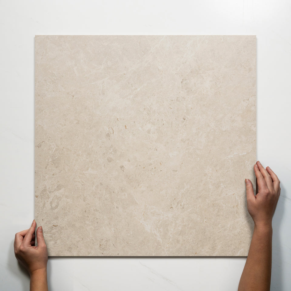
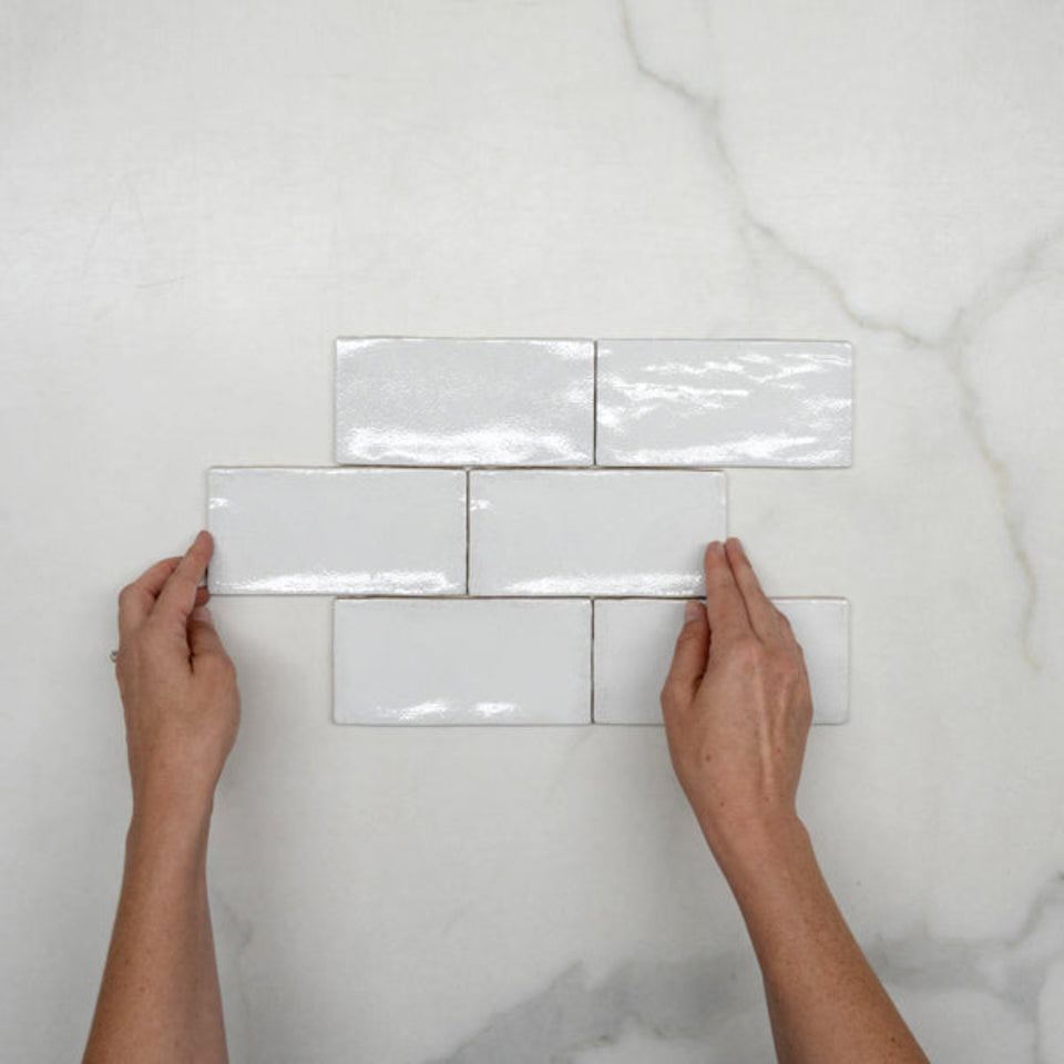
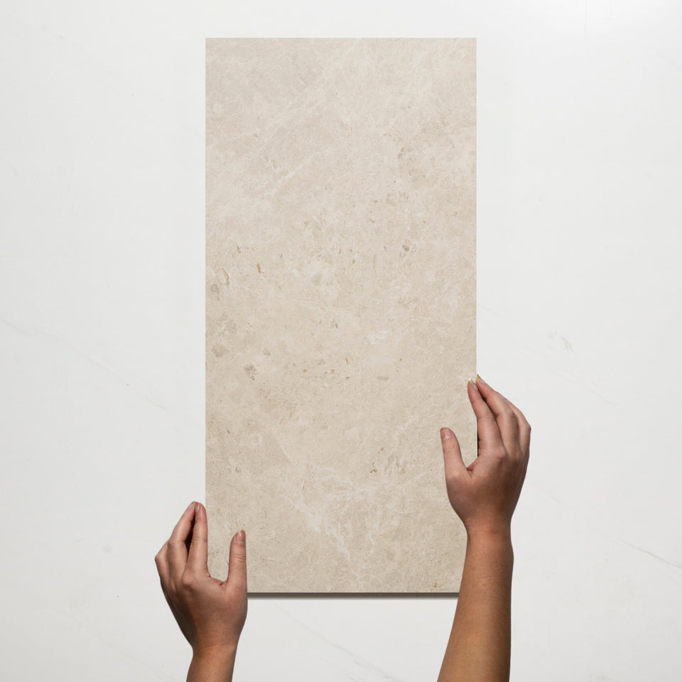
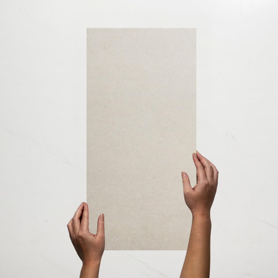

Up to 70% off across the store, plus free towels and mirrors up for grabs on orders over $800*


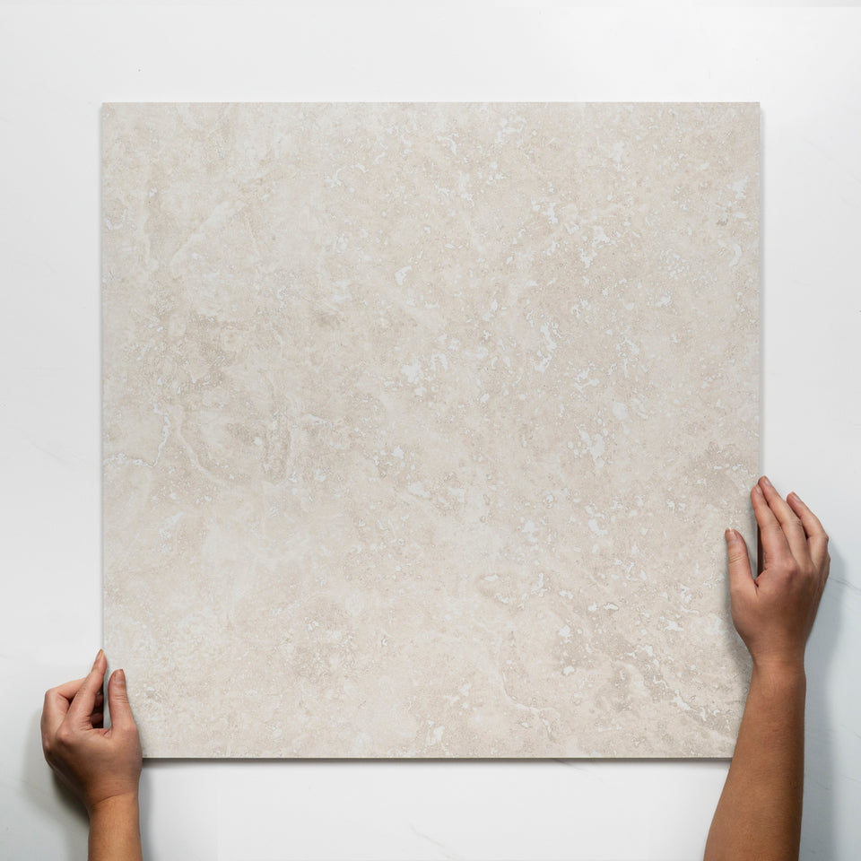
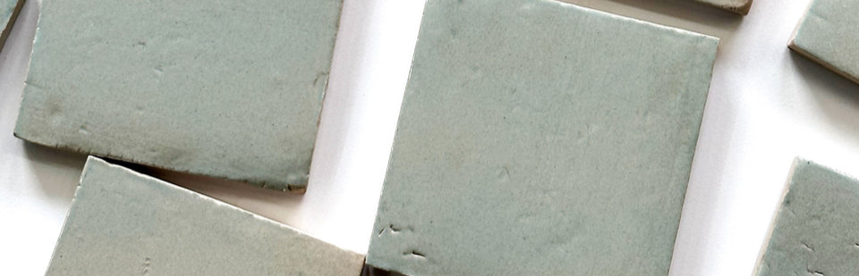

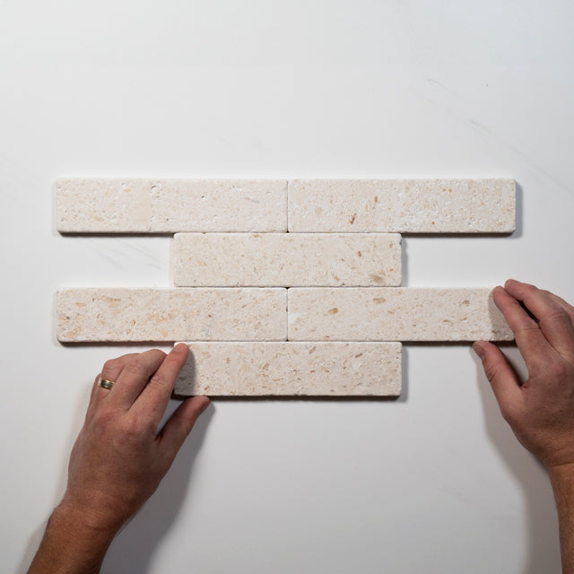
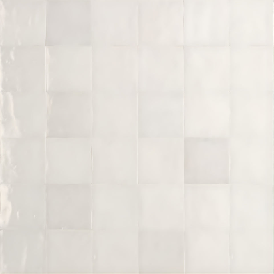


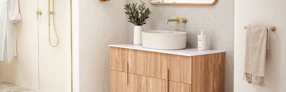


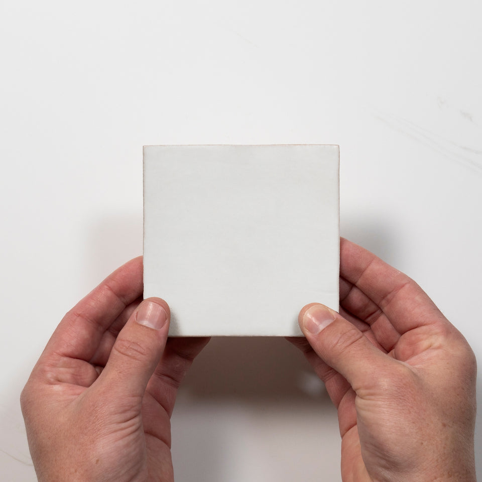


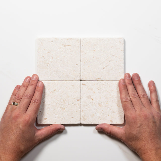


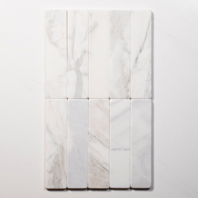

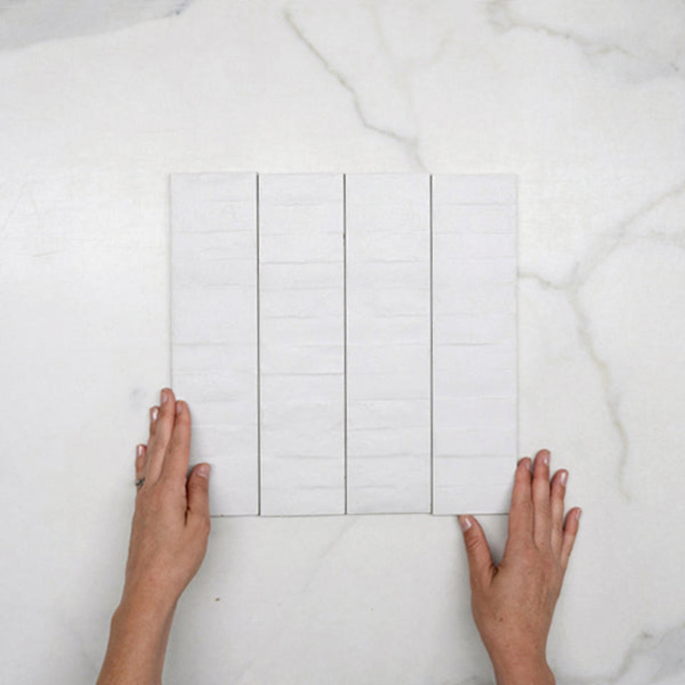
White is the easiest tile colour to live with, and one of the easiest to get wrong. It suits almost every room style, pairs with timber, stone and terrazzo, and gives a room a clean, fresh base. It shows marks, depends on light, and comes in more shades and textures than the name suggests.
This collection covers white tiles across porcelain, ceramic, natural stone and marble, in matte, gloss, polished, satin and textured finishes. The sections below cover what white does in a room, how to choose a finish and a shade, which materials need what, and where each type of white tile can go. For specific rooms, the bathroom tiles collection and the kitchen tiles collection sort the full range by room.
White surfaces return more of the available light than darker colours, which can help a room feel brighter. A gloss finish reflects light more strongly, and a matte finish gives a softer, less reflective result. The effect depends on the room itself: windows, mirrors, artificial lighting and the surrounding finishes all change how bright a space feels. White tiles alone won't make a room look larger. They do remove some of the visual weight of darker walls, and light grout, a simple layout and white surroundings add to the effect.
White also works as a backdrop. It suits timber, stone, terrazzo and coloured accessories, and the rest of the room can change around it. A soft white gives warmth, and a crisp white gives a modern edge.
Finish is the first decision, because it changes the look and the upkeep. A gloss white catches light and keeps a wall bright, which helps in kitchens and bathrooms without much natural light. The trade-off is that gloss shows water spots and fingerprints more readily, so it rewards a quick wipe. Matte white sits back and reads calmer. It hides minor marks and reflections better, which suits a splashback behind a cooktop that sees daily use.
Texture adds depth without adding colour. Ripples, patterns and sculpted shapes break up a large surface and avoid a flat look, and they're often used on feature walls where a quiet backdrop is wanted. A rippled handmade-look ceramic gives a subtle glow, a geometric pattern adds layers, and a slim finger mosaic laid vertically can make a room feel taller.
In this collection, the product pages print matte, grip, polished, gloss, satin, lappato and three-dimensional finishes. Matte and grip are the most common, which matters for floors, since a matte white on the floor adds grip and a more subtle look.
White is a natural splashback colour because it complements most benchtop colours, and stone, terrazzo, concrete and timber all sit well against it. Gloss is the easy pick for most kitchens because it wipes clean and bounces light around the room, while matte gives a softer, flatter look that hides fingerprints. Mosaic tiles come on mesh sheets, which makes small runs and tight corners easier to tile, and a margin for cuts and waste is worth adding when you measure.
In a bathroom, white wall tiles bounce light around and give an airy, spacious feel. Ceramic white wall tiles are a common choice above vanities and in showers, and porcelain gives floors extra durability. In laundries, white supports the sense of cleanliness people want in a utility room, and it helps small areas feel less enclosed.
White tiles work in living areas, bedrooms and dining rooms too, on floors or walls. A textured or patterned white feature tile adds interest while keeping the room calm, which suits living areas where a quieter backdrop is wanted. The feature tiles collection has more statement options.
White tiles come in a wide spread of finishes. Matte gives a contemporary, understated look, and gloss maximises light reflection and visual impact. Polished surfaces feel more formal, and honed, satin and grip finishes suit different practical needs. Natural stone whites are often honed or tumbled, and terrazzo and porcelain whites are often matte. The product page prints the finish, so use that line to match a tile to the room.
White is rarely just white. Some whites lean warm, some lean cool, and some carry grey, cream or chalk undertones. A white tile can look quite different beside a stone benchtop or a painted wall than it does on a screen, so compare a sample against your benchtop, cabinets and paint in your own light before you commit.
The names in this collection hint at the range: snow white, bianco and off-white, plus limestone, terrazzo and marble whites. If you're pairing white with another neutral, the beige tiles collection and the grey tiles collection show the neighbouring shades.
Porcelain and ceramic are the working materials. Both are glazed, easy to clean and stand up well to heat and splashes. Porcelain is the denser and more hard-wearing of the two. The listings here describe most porcelain and ceramic tiles as easy to clean, and several say no sealing is required.
Natural stone and marble are different. They look beautiful, and they're porous, so they need sealing and more care around acidic spills. The natural stone white tiles in this collection print a care consideration that requires sealing. Terrazzo looks, which are mostly porcelain here, give a stone aggregate pattern without the same upkeep. Check the Material and Maintenance lines on a tile before you assume what it needs.
White tiles in this collection run from small formats to large ones. Common sizes include 300 x 300, 450 x 450, 300 x 600, 600 x 600 and 600 x 1200, with smaller subway and mosaic formats such as 65 x 265 alongside them, and thickness runs from 6mm to 10mm. Shapes are mainly square and rectangular, with some herringbone, kit kat, penny round and hexagon formats.
Size changes how a wall reads. Smaller formats create more joints, while longer formats reduce the number of visual interruptions across the wall. The wall dimensions matter as much as the tile size: a format that looks balanced on a wide vanity wall can create awkward cuts in a narrow shower, so check the full wall width and the fixture positions before you settle on a proportion. The kit kat tiles collection covers the long, narrow mosaic format in more depth.
Start with the tile, because it's the largest and most permanent surface in a bathroom or kitchen. Once the floor and wall tiles are chosen, selecting paint, vanity and fixture colours gets easier.
A simple way to keep a scheme balanced is the 60-30-10 rule. About 60% of the colour comes from the dominant surface, usually the wall tiles or paint. About 30% is the secondary colour, often the vanity or the floor tiles. The last 10% is the accent, in tapware, towel rails, grout or feature tiles. With white as the dominant colour, a timber vanity or a dark floor can take the 30%, and brushed brass, matte black or chrome can take the accent.
Style guides pair white with different partners. Coastal and Hamptons rooms lean on soft blues, crisp white and brushed chrome. Industrial rooms lean on darker tones, matte black tapware and concrete looks. An all-white room keeps interest through different surfaces, such as panelled walls, patterned floor tiles and matte fixtures. Beige and white is a soft, tonal pairing, and white with a blush basin or a sage green vanity keeps the scheme calm. This collection's pages are tagged across Scandinavian, Traditional and Mediterranean styles, among others, so the same white can sit in several of these.
The tile face is the easy part. A glazed ceramic or porcelain face is usually straightforward to wipe with a mild detergent and a soft cloth, and flat surfaces are easier to clean than rippled, bevelled or heavily textured ones. Mild products do the job. The listings here describe most tiles as easy to clean, with a handful printing wipe-clean instructions.
Grout needs its own plan. A tile layout with many joints, such as subway or mosaic, has more grout to clean and inspect, especially around showers and vanity splashbacks. Cement-based and epoxy grouts have different care needs: some cement-based products may need sealing, and epoxy grout can offer stronger stain resistance in some applications. Follow the grout manufacturer's instructions for sealing and cleaning.
The product pages print the details for each range.
Cairnwell and Avedon are stone-look and limestone-look porcelain with soft tonal variation and subtle veining, described as understated enough to work in a wide range of interiors. Nimbus captures the soft movement and colour variation of natural stone, with 24 unique faces so each piece has its own pattern. Roccia is a raw stone look with subtle natural textures and soft tonal movement, in a lappato finish. Plastra brings the look of hand-trowelled or pressed plaster, with soft linear textures and a matte, chalky finish.
Tuscan is a travertine look in white, in glazed porcelain. Southside is a terrazzo made in Australia, described as tough enough for busy living. Olivia is a feature decor range, made in Italy from full-bodied glazed porcelain, with a matching 600 x 600. Soluna is a 150 x 150 porcelain that draws on the Mediterranean coast, with warm natural tones and soft textures.
Handmade looks are here too. Ella is a zellige-inspired 100 x 100 Italian ceramic with a wavy structured gloss finish, Dianna is a Spanish 75 x 150 handmade-look ceramic, and Flute is a narrow glazed finger mosaic with a gently concave profile. The zellige tiles collection and the mosaic tiles collection cover those formats in more depth, and the marble look tiles collection and terrazzo look tiles collection cover the stone patterns.
Yes, on a few conditions. White reflects light, which helps in small or windowless bathrooms, and it suits modern, coastal and traditional styles. White also shows soap scum, which some owners find helpful for staying on top of hygiene.
The conditions are about grout, finish and installation. A white-on-white bathroom can feel flat, so a mix of surfaces, such as panelled walls, patterned floor tiles and matte fixtures, keeps it interesting. A tile is not a waterproofing layer, and professionals who understand how to seal the edges and keep water out are the way to prevent mould. Matte white on the floor adds grip.
The floor tiles collection and the wall tiles collection list tiles by where they go. Read the Application line on any tile before you choose it for a floor.
The Application lines in this collection separate wall tiles from floor tiles. Many tiles are listed for walls and floors, and a number say walls only. Some pages print a wear rating of 0 and a line such as intended for wall applications only, not suitable for flooring, while most floor-listed tiles print a rating of 3 or 4.
Slip ratings run from P2 and P3 to P4 and P5, with some tiles not rated. A P3 line on several pages describes a moderate to high slip risk, suitable for flooring in dry areas. P ratings come from a pendulum test on a wet, flat surface, with P1 low, P2 and P3 moderate, P4 high and P5 very high. For a wet floor, choose a tile whose page prints the rating, and check it before you trust the colour.
White tiles show installation quality. The format is simple, but straight rows make errors easy to notice: uneven joints, drifting lines, lippage and awkward end cuts all stand out on a plain surface. Accurate installation starts with a flat, properly prepared surface and a clear layout plan, and corners, niches, tapware and shower fittings all affect where the cuts fall.
In a wet area, the tile, adhesive and grout sit over the waterproofed surface. The waterproofing underneath still does its own job. The product specification should confirm that the tile suits the intended wall and wet-area use. Several listings here print an Application and Area line for exactly that check, and some say installation must be carried out by a licensed tiler to the appropriate Australian standards.
Grout colour changes how white tiles read. A white or off-white grout lets a wall read as one soft surface, and a grey grout picks out every tile and plays up the grid or pattern. White grout reads as one continuous surface but may need more regular cleaning, and a light grey hides marks better while adding a subtle contrast. Strong contrast, such as black grout on white, creates a graphic result.
The listings here print a recommended grout gap, 1.5mm to 3mm on most rectified tiles and over 3mm on some non-rectified ones. Use the figure printed for the tile you buy. Decide the grout colour before you order, and check it against a sample.
White pairs well with timber, travertine and other natural tones, and the contrast gives a room warmth and brings out the texture of natural materials. A forest green kit kat with white grout, or a white tile backdrop with a soft blush basin, shows how white supports colour. White and sage green is a balance between traditional and modern, with a simple white tile on the wall keeping the room calm beside a patterned floor.
The travertine look tiles collection is one natural companion, and the subway tiles collection covers the classic white wall format.
White tiles have a few drawbacks. They show dirt and soap scum more clearly, and grout joints need regular cleaning, especially around showers and vanity splashbacks. A classic white subway layout is familiar, and straight rows make installation errors easy to notice, from uneven joints to awkward end cuts. Light and surroundings change how white looks, so a sample matters.
Choose the finish, the grout and the layout together, and pick a tile that suits the room. Each of these drawbacks is manageable with that planning.
Select white tiles suit outdoor areas, and the Area lines on the product pages say which. Some are listed for indoors and covered outdoor areas, some for indoors and outdoors including uncovered areas, and a few for outdoors. The white outdoor tiles collection and the outdoor tiles collection collect the tiles built for open exposure.
Start with where the tile goes, since that decides wall or floor and the rating. Then choose the material, the finish and the texture. Pick the shade last, with a sample beside your benchtop and paint. For a bright wall, choose gloss. For a calmer one, choose matte. For a floor, choose a rated, matte or grip tile.


